
Quick start guide
This quick start guide provides a small selection of conformant and non-conformant examples that highlight the main features of this GS1 guideline. It should not be used in isolation; the main body of the document provides substantially more detail that will be important to understand before making any changes to existing practices.
Conformant examples
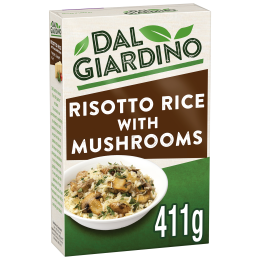
411g
Dal Giardino Risotto Rice with Mushrooms
★★★★★
$3.45


700g
Dal Giardino Bolognase Sauce 700g
★★★★★
£1.95
In both of these first two examples, it's easy to look at the product and see immediately who is the brand, what it is, which variety it is and how much of it there is. These are referred to as the 4Ws throughout this guide. For someone who has bought this item before, and who is perhaps placing an online order while multitasking and therefore not giving the screen their full attention, this is exactly what they need to know before clicking the Add to Basket button. There is no need for the consumer to read the product title, notice the customer rating or even the price to recognise the product.
In both [qsg2] and [qsg1], the who is the brand, what is it, which variety is it have been provided by the Brand Owner. The two examples show different approaches that a Retailer might take for showing the how much information immediately adjacent to the image. Retailers are encouraged to design and adopt a single approach to displaying how much within the MRHI Canvas throughout their site to create consistency across the Digital Shelf.

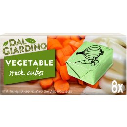
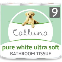
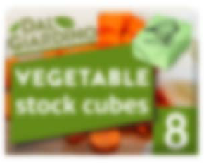
Dal Giardino Vegetable Stock Cubes 8 Cubes
★★★★★
$3.45
In [qsg7], who is the brand, what it is, which variety is it and how much are shown clearly in the Digital pack and no off-pack information is needed.
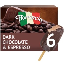
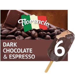
6
x 5oz
Florencia Dark Chocolate & Espresso Ice Cream 6 x 5oz multipack
★★★★★
€7.45
As with the previous examples, [qsg3] clearly shows the 4Ws of who is the brand, what it is, which variety it is and how much of it there is. Showing an individual item outside the multipack instantly communicates what each single unit is within the multipack.
Non-conformant examples
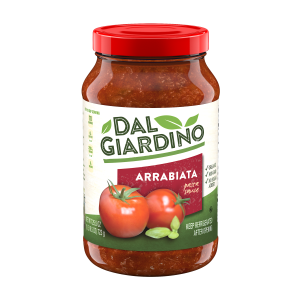
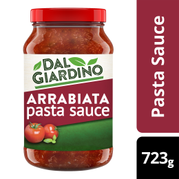
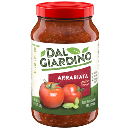
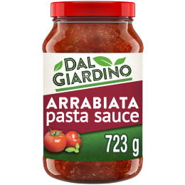
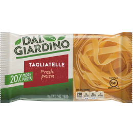
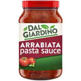
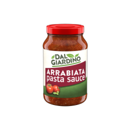
Dal Giardino Arrabiata Pasta Sauce 723g
★★★★★
£1.95

In [qsg4] the basic information is present but not clear from looking at, or immediately adjacent to, the image. A consumer will need to read the product title all the way to the end to be sure of what this is and how much of it there is. The image itself is surrounded by unnecessary white space making it even smaller than it needs to be in the already small space available. These factors can easily lead to a consumer ordering a product by mistake or, at least, ordering an unexpected quantity and therefore having a poor shopping experience.
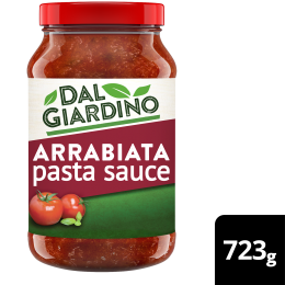
Dal Giardino Arrabiata Pasta Sauce 723g
★★★★★
£1.95


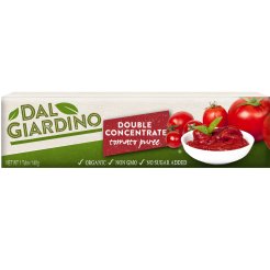
In [qsg5], the Brand Owner has included the how much off pack but in the image itself. Although this helps to convey the basic information that shoppers need, it is not fully-conformant with the GS1 Mobile Ready Hero Image Guideline for multiple reasons to do with machine processability and visual inconsistency. It is, however, acceptable by some Retailers while they develop their sites to show this information consistently across the Digital Shelf. There is specific guidance on this within the main body of the document as well as a clear statement on the issue.
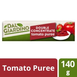
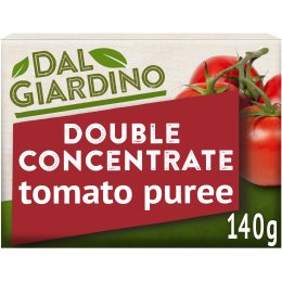
Dal Giardino Tomato Purée 140g
★★★★★
€1.99
The short/flat shape of the product in [qsgHorizontal] provides very little real estate to show the 4Ws. To overcome this, the Brand Owner has not only included the how much in the image tile but also the what is it as off-pack text. Again, this is non-conformant with the guideline for multiple reasons to do with machine processability and consistency. The inclusion of the prominent, brightly coloured stripe is visually disruptive on the Digital Shelf. Recognising that challenges remain, advice on conformant approaches to this situation is provided in the main body of the guideline.
Dal Giardino Arrabiata Pasta Sauce 723g
★★★★★
£1.95
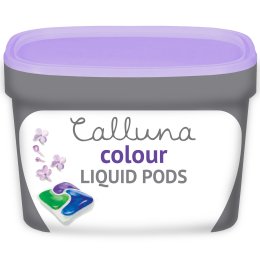
Calluna Scarlet Nail Varnish
★★★★★
$3.35
In these examples, off-pack text is again included within the image tile but the difficulty this causes is compounded by presenting it at right angles to the normal flow of text. Readers are encouraged to see the individual guideline on consistent presentation of off-pack information for more detail on why this approach is not conformant with the GS1 Mobile Ready Hero Images Guideline.

1 litre
Dal Giardino Extra Virgin Olive Oil 1 litre
★★★★★
£1.95
[qsg9] shows an attempt to convey the who is the brand, what it is, and the which variety is it by going beyond the confines of the Digital Pack (the how much is shown by the Retailer in the inferior quarter).
There are several problems associated with this approach, primarily the lack of immediate recognisability between the physical pack and the online image, and the scope for highly inconsistent presentations by different brands across the Digital Shelf.
What’s in this guideline
This document will help Brand Owners to:
- identify the key elements that shoppers need to make their purchase decisions;
- modify their pack design, where appropriate, to make those elements instantly recognisable;
- present single and multipack items effectively.
This document will help Retailers to:
- collaborate with Brand Owners to present products effectively on mobile devices;
- ensure that products presented on the digital shelf match those on the physical shelf;
- present off-pack information consistently.
Introduction
This GS1 guideline addresses issues concerning the presentation of products in online retail environments on small screens, typically alongside ‘add to basket’ functions.
The work has been driven by the shift in online retail from desktop to mobile as consumers increasingly shop from their smartphones. This shift presents specific problems for the Brand Owner and Retailer:
- the physical size of the screen/digital shelf;
- momentum scroll, that is, the ability to scroll rapidly through a list, semi-independently of the user’s finger movement;
- consumer behaviour which, for CPG and other replenishment items, tends toward an extremely limited attention span, that is, consumers make decisions more or less instantly.
The factors of screen size and limited attention span augment many of the problems already faced in desktop-centric online retail environments and can easily lead to a poor consumer experience such as:
- frustration in not being able to find the product(s) they seek;
- incorrect identification of the product;
- incorrect ordering of the size/quantity of the product.
The guideline does not seek to limit creativity or differentiation by competing brands and retailers; rather, the aim is to foster a consistent approach that will improve the consumer experience.
Scope
The guideline is specifically focused on replenishment items, that is, products with which consumers are already familiar and therefore to which they will pay less attention when ordering online. Importantly, this rules out high value or infrequently-bought items over which a consumer is much more likely to spend significant time.
Presentation on larger screens and in, for example, advertising, are out of scope although images created in accordance with this guideline may be used anywhere. The term ‘small screen’ is not strictly defined to allow for future evolution of the term but is taken to mean hand held devices and to exclude anything as large as, or larger than, a tablet.
Audience
The presentation of products in a physical store has always been the result of a collaboration between Brand Owner and Retailer; this remains the case for online presentation. The guideline is offered to both Retailers and Brand Owners as the basis for continued collaboration in the challenging environment of shopping on mobile devices.
Objectives
The aim of the guide is to ensure that key information is always made available to users of small screens in such a way as to:
- help people find the product they need more easily*;
- increase incremental sales across the business (all platforms);
- reduce the frequency of ‘accidental’ basket adds that were not what the shopper thought it was*;
- reduce brand, retailer and solution providers’ time spent designing, vetting and discussing online presentation;
- improve the consistency of presentation;
- increase the visual appeal of product images.
* in some circumstances, this might include staff picking items for collection or delivery.
When measuring whether or not these objectives have been met, it's important that tests are not conducted purely on the image itself – what this guide calls the Digital Pack – but in the context of the Digital Shelf where multiple products are shown together. A Digital Shelf might be limited to a specific category, a product type or a searched-for brand in which case the variation across the shelf is likely to be limited. However, it can equally easily comprise a user’s favourites, the retailer’s promotional offers or seasonal items with very different products next to each other.
Research
The guideline presented here is underpinned by research carried out by multiple organisations. Qualitative and quantitative studies have included shopper journeys, eye-tracking, A/B split testing, task-based shopping and more. Each individual guideline addresses a specific point that has been tested in some way. The more prescriptive the individual guideline, the stronger the research base on which it builds. The definition of the key elements that a shopper uses as the basis of their decision making is particularly well-researched and is the foundation of the document.
Guideline structure
Each individual guideline is presented in four parts as follows:
Intended outcome
What should be true after the individual guideline has been implemented.
Explanation
A summary of why this intended outcome has been included, in particular:
- why this is specifically relevant to small screens;
- how it improves the consumer experience.
Possible approach to implementation
One or more ways in which the intended outcome can be achieved. This represents the best advice available at the time of writing but specific circumstances and future developments may mean that alternative implementation methods are more appropriate to achieve the intended outcome.
How to test
Information on how to assess whether the intended outcome has been achieved. Whether one or more of the possible approaches to implementation has been followed is irrelevant to the outcome of the test.
Images in this document
Mobile images used throughout this document have been provided courtesy of ![]() . They show fictitious products and have been created specifically to illustrate this guideline. They include both conformant and non-conformant examples as described in the text. All conformant examples have been tested for visual clarity.
. They show fictitious products and have been created specifically to illustrate this guideline. They include both conformant and non-conformant examples as described in the text. All conformant examples have been tested for visual clarity.
Definitions
The following definitions underpin the guideline.
Mobile Ready Hero Image
A Mobile Ready Hero Image (MRHI) is a representation of a real world product that may differ from a standard pack shot, but that maintains the majority of the physical pack’s key elements of design, shape and colour, and is therefore recognisable on a Digital Shelf.
The image should include, or be closely associated with, key elements customers are likely to use when making a purchase decision/choosing the correct product from search results.
The 4Ws (Key Elements)
The definition of a Mobile Ready Hero Image includes reference to key elements customers are likely to use when making a purchase decision. Research carried out by multiple organisations as to what constitutes the key elements within the scope of this guideline leads to the definition of ‘the 4Ws’ as follows:
- Who is the brand? This maps directly to the GS1 Global Data Dictionary and Web Vocabulary definition of the Brand name, the recognisable name used by a Brand Owner to uniquely identify a line of trade item or services. This is recognisable by the consumer. There may also be a sub brand: the second level of a brand, which can be a trademark. The sub brand is the primary differentiating factor that a brand owner wants to communicate to the consumer or buyer. For example: Yummy-Cola Classic. In this example Yummy-Cola is the brand and Classic is the sub brand.
- What is it? What is the type of product? Is it a shampoo, a cat food, an ice-cream, a soft-drink etc. This usually maps to the GS1 Global Data Dictionary and Web Vocabulary term Functional Name and should help clarify the product classification associated with the GTIN. For example, ‘moisturiser’ (for personal care products) or ‘multi-surface’ (for cleaning products). For many products, this information will be conveyed visually and not by text; there is no need to annotate a bottle of water with the word 'water' for example.
- Which variety is it? This usually maps to the GS1 Global Data Dictionary and Web Vocabulary term Variant Description and covers the distinguishing characteristics that differentiate products with the same brand and size including such things as the particular flavour, fragrance or taste. ‘Still or sparkling’ is a specific example for soft drinks.
- HoW much of it is there? This usually maps to the GS1 Global Data Dictionary and Web Vocabulary term net content: the amount of the product contained by a package, usually as claimed on the label. For example, 750ml of a liquid or gel; the number of diapers in a pack, the number of washes that a box of laundry powder will support etc. In the case of a multipack, it is important to state how many individual items are contained within the multipack as well as the size/weight/amount of each item. For fixed value trade items, use the value claimed on the package, to avoid the variable fill rate issue that arises with some trade item which are sold by volume or weight, and whose actual content may vary slightly from batch to batch. In case of variable quantity trade items, the net content indicates the average quantity.
In some cases, the 4Ws may need to be augmented to provide sufficient information for a consumer to make a choice. For example, a Which variety is it might need to include the target age range, such as ‘kitten 0-6 months’ or ‘1-2 years’. Likewise, the howW much might need to cover multiple dimensions such as the number of sheets and the overall length of a toilet roll. In these circumstances it will be necessary to include additional information. This is referred to throughout the Mobile Ready Hero Image Guideline as the plus one message (even if it has multiple elements).
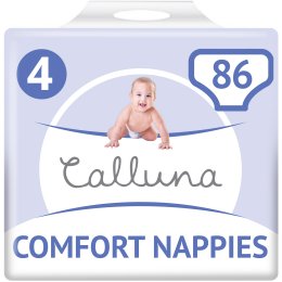
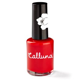
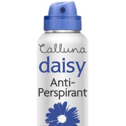
[nappies] shows:
- who is the brand : Calluna
- what is it : nappies/diapers
- which variety: comfort, size 4
- how much : 86
So in this example, the ‘size 4’ is a plus one.
The Plus One is always optional and is explicitly not a marketing message, i.e. material that has the intention of persuading a consumer to make a transaction. It is there to cover the extra needs of certain types of product and should be present on the front of the physical pack. There is more guidance on this point in the main body of the document.
Digital Pack
The term Digital Pack is used to refer to the representation of the product pack itself, as distinct from any other elements that may be present in the Mobile Ready Hero Image Canvas. The design of the Digital Pack is entirely in the hands of the Brand Owner.
Image Tile
The Image Tile is the actual image, which is usually but not necessarily square, comprising the Digital Pack and any white space.
Mobile Ready Hero Image Canvas
The MRHI Canvas is the total area of the Mobile Ready Hero Image. This includes the Image Tile and any off-pack information that is immediately adjacent to the Image Tile.
Shelf Item
The Shelf Item is the entire presentation of the product on the Digital Shelf, including the product title, any marketing information, Add to Basket functions, customer ratings etc.
The Digital Shelf
The Digital Shelf is a presentation of multiple items on a single screen (almost always scrollable). A Digital Shelf can be defined in two ways: using retailer taxonomies and by search term. As with customer favourites, the latter can put products together that would never appear side by side using a retailer taxonomy or on a physical shelf in a store.
On-Pack/Off-Pack
Information conveyed visually within the digital pack is known as on-pack information.
Information that is shown within the MRHI Canvas but not on the Digital Pack itself is off-pack information. For the purposes of this guideline, off-pack information does not include any aspect of the Shelf Item outside the MRHI canvas.
Overlays
Overlays are visual elements that obscure part of the Mobile Ready Hero Image.
Roundel
A Roundel is a visual design element, a small disc, that conveys information about the product. Typical examples include award medallions, environmental claim logos etc.
Category
A category of product, such as soft drinks, personal care items, cereals etc. With few exceptions, a category will include multiple products from multiple brands.
The guidelines
The Digital Pack should be recognisable as the physical product
Intended outcome
The customer should not be able to notice, at a glance, any discernible difference between the physical pack and its online representation on a mobile device. Visual elements that appear on the Digital Pack should be consistent with the ones used on the physical pack.
Explanation
It is important that consumers recognise products they see in the physical store as being the same as those depicted online and vice-versa. Only with such recognition can consumers make rapid online purchasing decisions with accuracy and confidence.
Possible approach to implementation
Product recognition is achieved through aspects such as colour, shape and design. Using those same elements in a small image is critical to conveying the 4Ws, although the elements need not necessarily be identical in relative size and position (see later guidance on decluttering and zooming). New design elements not present on the physical pack should not be introduced on the Digital Pack.
Recognition may be improved by showing the product from an angled position, usually elevated, to show pack depth. Although this is encouraged, use only a small elevation so as to minimise the loss of space to show the front of the pack. The greater the angle of elevation the more difficult it will be to maintain visual clarity.
How to test
Whether a Digital Pack and a physical product are recognisably the same item is clearly a subjective judgement. Nevertheless, it is possible to check that all visual elements and styles used in the Digital Pack are also present, or at least consistent with, the physical product’s packaging, ignoring relative position and size.
Declutter and enhance the image
Intended outcome
Visual elements of the Digital Pack convey the 4Ws as clearly as possible.
Explanation
The canvas for an MRHI is small and must therefore be used efficiently. Any elements that do not convey the 4Ws will take up space, thereby reducing that available for conveying the information a consumer needs to make his or her choice. Text on an image that is illegible on a small image can legitimately be removed to make space for the 4Ws to be made bigger and therefore more legible.
Possible approach to implementation
For each visual element in the overall design of the pack, consider whether it conveys any of the 4Ws or is otherwise essential for product recognisability. If not, it should probably be removed entirely from the Digital Pack. If it does, consider whether it can be made larger and/or clearer, perhaps using the space vacated by the elements that have been removed.
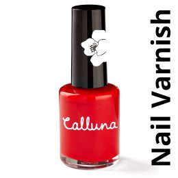
There are some elements that you ‘get for free’, that is, some information will be obvious and not need to be stated explicitly (see [nailvarnish]). For example, a bottle of water is unlikely to be mistaken for anything else so you get the What is it for free. Likewise if a brand variant, such as ‘diet,’ is strongly associated with a colour, the Which variety is taken care of by those colours without having to state it in text on or off pack. In rare cases, a particular type of product may be sold in a specific size so that might not need to be stated. However, take care — such regularity must apply across the category for multiple brands, remembering that the Digital Shelf may be constructed to show any products next to each other, whether they are closely related or not.
The nail varnish example in [nailvarnish] is unusual but is conformant because of the way consumers shop for the particular type of product. The What is it is obvious from the shape of the product with Who is the brand covered by both the name written on the bottle and the flower motif on the lid. The general colour — red — is also obvious. The specific colour, the Which variety, is only given in the product title. This conflicts with the advice on not relying on the product title to convey the 4Ws. However, the consumer has already found what she's looking for and is just using the title to confirm a detail. In this case, the product title is an appropriate source of information.
15ml
Calluna Scarlet Nail Varnish 15 ml
★★★★★
$3.35
The individual guideline on Visual Clarity means that it is not always possible to include all 4Ws on the Digital Pack. This is particularly true for tall and thin or short and flat products. In such cases, one or more of the 4Ws will need to be removed, starting with the how much, and will need to be presented off pack in a consistent manner.
It may be tempting to enlarge some of the 4Ws to the extent that they go beyond the boundary of the pack (often called 'breaking the pack'). Likewise, it may be tempting to add roundels or other visual elements to the Image Tile that are not part of the Digital Pack. Neither of these approaches is conformant on the grounds that:
- it causes visual inconsistency across the Digital Shelf;
- it works against the need for digital/physical recognisability
It is recognised that this individual guideline presents significant problems for some products and that presenting the 4Ws consistently remains challenging in those cases.
The following section shows conformant examples of decluttering/enhancements. [declutterExample1] exemplifies the overall methodology. The size of the brand name has been reduced but remains clear; information that is printed on the side of the physical jar has been removed. These changes allow the dark red area of the label to be to be expanded. The tomatoes have been reduced in size to allow the words ‘arrabiata’ and ‘pasta sauce’ to be made larger. Small white text on the green areas of the label has been removed to make space to add in the size of the jar. The cursive font used to write ‘pasta sauce’ has been replaced with a sans-serif font and the text is shown flat rather than curving around the jar. Despite these changes, the product remains instantly recognisable online and on the shelf.
Similar changes are shown in [declutterExample2]. By moving the flower design further to the side, space has been created to make the information given on the product much larger. Note that the how much is not included in the image and must be provided by the retailer.
The next example, [declutterExample3], shows how, if done carefully, a small change in the shape of the pack can sometimes be helpful.
The original pack has an aspect ratio of 1:2 (i.e. it's twice as wide as it is high). In the decluttered and enhanced image, the shorter side has been extended by 150%. This pushes the image to the edge of recognisability. The MRHI still conveys that the product is wider than it is high but has sufficient space to convey the 4Ws effectively. This can be taken too far, however. [declutterExample4] shows a tube of tomato purée that has an aspect ratio of nearly 1:4. In the decluttered image, the shorter side has been extended by 280% to create a near-square pack but in doing so, the product has become unrecognisable as a tube of tomato purée. There is no precise numeric boundary between what is conformant and non-conformant but extending the shorter side by no more than 150% is probably a good metric. However much the shorter side is extended, it is essential to retain recognisability between the physical and the digital.
How to test
Check that there are no visual elements in the Digital Pack that distract from one or more of the 4Ws.
Any element added to the Digital Pack should convey the 4Ws
Intended outcome
Elements of the Digital Pack must be present on the physical pack. Elements moved to the front of the Digital Pack must convey one or more of the 4Ws.
Explanation
On the physical shelf, some of the 4Ws are conveyed by the size of the product, by labelling on the back of the pack, or other factors absent from a picture of the front of a pack. When shown on a small screen, these may be added to the Digital Pack using the brand’s styles, however, it is vital to remember that the Digital Pack must be recognisable as the physical pack. Adding any prominent design element to the Digital Pack that is entirely absent from the physical pack is therefore non-conformant.
Possible approach to implementation
This is a very subjective area but if it is necessary to add elements to the Digital Pack, use the colours and visual styles already used on the physical pack. Think of it as a simplified pack design for the product, rather than an advertising banner as a separate concept.
In [bringToFront], the first image is the original pack shot; the second is non-conformant as it includes the 'Aloe Vera enhanced' roundel which does not convey any of the 4Ws and is not present on the front of the physical pack. Only the final image, that does not include the Aloe Vera roundel, is conformant.
As in the previous example, the first image in [bringToFront2] is the original pack shot; the second is non-conformant as it includes the hoW much in a completely random style that does not match the brand styles. The final image includes the hoW much in keeping with the style of the rest of the pack and is therefore conformant.
How to test
Check that any visual elements used in the Digital Pack that are not present on the front of the physical pack convey one or more of the 4Ws, are present elsewhere on the physical pack, and use a visual approach that is consistent with the rest of the Digital Pack.
Check visual clarity of the Digital Pack
Intended outcome
The 4Ws, as displayed within the MRHI Canvas, can be perceived 'quickly and with certainty' via normal use of a mobile device.
Explanation
A standard pack shot as used in presentations on larger screens is unlikely to be as effective in communicating information when resized to fit into a Shelf Item template on a mobile device. Shape and colour – always important in conveying information in a crowded retail space – are likely to be preserved; logos may still be recognisable even when detail is not perceivable. However, where text is used on the pack, typically in line with the overall brand style, one or more of the 4Ws may not be clear. Conveying the hoW much is a remaining challenge for tall, thin products, such as bottles, and where the same shape is used in different size variants of the product, noting that online, all product images are presented in a uniform size.
A visual clarity test is useful in deciding at what point an element of the Digital Pack is too small to be read, and/or the whole Digital Pack is too cluttered, and therefore when elements should be resized or repositioned. For some products, it will be necessary to declutter the image to such an extent that one or more of the 4Ws will need to be removed entirely, starting with the hoW much.
Where non-inclusion is necessary, every effort should be made by the Brand Owner and Retailer to present the 4Ws within the MRHI Canvas.
Possible approach to implementation
At the time of writing there is no single, internationally recognised standard visual clarity test. However, this individual guideline offers a number of characteristics that are important when looking for, or designing, such a test.
- Is the test conducted on a mobile device? It is all too easy to test designs on a large, desktop screen and then perhaps shrink it down to a small size and look at it on the same screen. This is not the same as actually putting the image on a handheld screen, perhaps in adverse lighting conditions.
- Does the test include a calibration step so that different people’s eyesight can be compared?
- Is the test underpinned by sound visual science principles?
- Does the test consider minimum contrast between foreground and background? The W3C Web Content Accessibility Guidelines offer an international standard definition of minimum contrast at 4.5:1 [WCAG].
The University of Cambridge Engineering Design Centre's See-It test [See-It] meets these criteria, is available Royalty Free, and is recommended. Another approach that can be helpful during the development of the image is to use the Gaussian Blur [GB] function typically avaiable in image manipulation software. A Gaussian Blur with a radius of 34 pixels applied to a 3000 x 3000 pixel image electronically simulates the challenges of viewing an image that renders at 16 x 16 mm on a mobile phone held 40cm from the user. This has been applied to the first image in [vc1]. The second image is the original as seen elsewhere in this document. The distance of arm's length simulates how the pack would look to someone with worse vision than the assessor and who may have to hold the phone slightly further away due to age-related long-sightedness. In this example, even someone in this situation is likely to be able to read the 4Ws in the image.

How to test
Not applicable in this case since the subject of this individual guideline is itself a test.
Use medium zoom where appropriate
Intended outcome
The 4Ws are shown as clearly as possible on the Digital Pack
Explanation
The Digital Pack must be recognisable on the physical shelf and vice versa. The shape and colour of the overall pack, as well as design elements shown on it, are all part of that recognition process. However, in some cases, it is possible to achieve that recognition by only showing part of the product and, in so doing, creating more real estate on the Digital Pack for conveying the 4Ws.
This is particularly true where:
- the product shape is generic, such as a trigger spray or a shampoo bottle;
- the recognisable aspect of the shape of the product only applies to a specific part of it, such as the top of a bottle.
In other words, it is not always necessary to show the entire product to retain that crucial recognition by the consumer. That said, some research indicates that consumers like to see the whole product, therefore this guidance cannot be prescriptive.
Possible approach to implementation
Medium zoom, up to a maximum of 150%, is right for some products, but not for all. It is for Brand Owners, in consultation with their Retailers, to strike the right balance between visual clarity and product recognition.
[zoom1] is an example where it helps. The first image is the original pack shot; the second is decluttered and zoomed to maximise the available space in which to show the 4Ws more clearly, however, it still fails the visual clarity test used. In the third image, the hoW much has been removed and will need to be shown by the Retailer. The remaining text has been further enhanced and the outer cap has been removed. Both of these steps help to clarify the what is it and at this point, the visual clarity test has been passed, but there are further improvements that can be made. Firstly, the cap has been rotated to show the nozzle and the word 'fresh' has been removed, allowing the word 'daisy' to be made bigger. Both of these steps make it easier to see which variety it is.
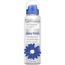
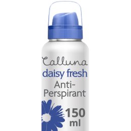
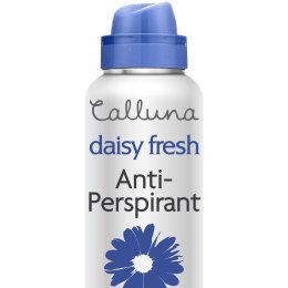
In this case, the shape of the product is not lost by zooming as the inclusion of the inner cap and nozzle shows that it's an aerosol, but this will not always be the case. Therefore Brand Owners will need to experiment with different options to find the best one.
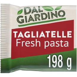
In contrast, [zoom2] shows where zoom is not appropriate. In it, the second image is zoomed in to create a square. Although this creates a lot of real estate, the What is it is now only conveyed as text which is not as immediate as seeing the tagliatelle itself. Moreover, the product is no longer recognisable on the shelf as the shape of the physical product is completely lost.
How to test
If medium zoom is used, check that the product is still recognisable on the physical shelf with key features of the product, including its shape and colour, preserved. Because of its highly subjective nature, this test should ideally be carried out with shoppers.
Present off-pack information consistently
Intended outcome
The 4Ws are present in the MRHI Canvas with off-pack information provided in a distinctive, consistent and structured manner across a retailer’s Digital Shelves.
Explanation
As emphasised throughout this guideline, consumers will need to assimilate the 4Ws before making a purchase decision. Where possible, these should be provided within the Digital Pack, however, space is always limited (severely so for some product shapes) and so including all the information can easily lead to a loss of visual clarity which should be avoided.
In these situations, off-pack information becomes more critical. Off-pack information should be provided within the MRHI Canvas, i.e. within the field of vision when the Digital Pack is the point of fixation [PoF]. Specifically, fast recognition should be possible without having to read product titles, enabling shoppers to visually scan the Shelf Item without making lots of saccade movements.
All of the 4Ws are important for the consumer's decision making process but when there is insufficient room on the Digital Pack to include them without losing visual clarity, the how much is the first element to remove. There are two reasons for this:
- it is the element most easily presented separately by the retailer within the Shelf Item and irrespective of its inclusion in the Digital Pack;
- the mobile/small screen context challenges the consumer's perception of size more than any other element and is the most likely cause of a mistake when ordering, therefore, clarity and consistency of the presentation of the how much information is particularly critical.
Brand Owners and retailers can collaborate to ensure that the how much is provided in the same relative location and same style across the Digital Shelf to make understanding by the shopper as easy as possible. The recommended position is the inferior quarter, that is, the bottom right for languages written left to right, bottom left for languages written right to left. This is because eye tracking studies show that consumers' eyes generally follow a Z pattern when looking at a product online. In the rapid replenishment style shopping that is the scope of this guideline, by the time a consumer's eye reaches the inferior quarter, the only piece of information they're likely to need in order to make a purchase decision is the how much.
It is not an error to include how much both on and off-pack.
Possible approach to implementation
The content of the MRHI Canvas is primarily the responsibility of the Brand Owner. That is, the Digital Pack and informational content that comprise the 4Ws should be made available by the Brand Owner and accessible as discrete pieces of information.
The composition and presentation of the MRHI Canvas is primarily the responsibility of the retailer. Consistency across the Digital Shelf and the retailer’s own brand values are important determinants of the detail of the presentation. Furthermore, the retailer will know more about the user’s context, such as whether they’re quickly re-ordering favourites or browsing the digital store using the taxonomy etc. It may be advantageous to alter the presentation depending on this contextual information. For example, by presenting information in different languages, or showing the how much in imperial or metric units.
This separation of content and presentation [SCP] leads to Brand Owners being discouraged from treating the Image Tile and the MRHI Canvas as a single entity and therefore including off-pack information within the Image Tile. The inclusion of off-pack text within the Image Tile is non-conformant and not accepted by everyone, including some major search engines, but is accepted by some Retailers as an interim solution while they improve the consistency of presentation across their Digital Shelves. More detailed reasons for this advice include:
- Including off-pack text on some images and not others leads to inconsistency across the Digital Shelf. Digital Shelves may be created in response to search queries and consumer preferences that can put very different items next to each other in unpredictable ways.
- Brand Owner-provided off pack text within the Image Tile is likely to be used inconsistently by different brands, in terms of the information conveyed, styles and colours used. This can quickly lead to visual noise, making it harder for consumers to make the correct choice.
- When considering an image in isolation, it is tempting to turn text at right angles to the usual flow of text to make use of white space within the Image Tile. Research shows that some users find it awkward compared with text written in the usual flow (i.e. horizontal for most languages, but vertical for some Asian languages).
- Although discouraged from doing so, many retailers will add their own overlays on top of product images. This looks particularly bad if a retailer's overlay sits on top of a brand owner's off-pack text.
- Text within an Image Tile does not always scale well, so that if the size of the Image Tile on the screen is significantly different from the size produced by the Brand Owner, legibility can easily be lost. This problem does not arise when text is presented as part of the Shelf Item.
- Text written within an image is entirely opaque to screen readers and therefore inaccessible to users with visual disabilities.
- Text written within an image is almost always unavailable for functions like search, filtering and sorting. Whilst some advanced software can process text written with an image, it is substantially more difficult and error prone than simply processing text.
- As noted, off-pack information can be presented in line with the retailer's own style of design as well as being tailored to the specific user context, taking account of factors such as preferred language, units of measure, previous purchases and more.
Brand Owners and retailers are likely to work with solution providers as intermediaries so that what the consumer sees will be the result of a collaborative effort. The detail of how that collaboration achieves the intended outcome must be a matter for the stakeholders concerned.
See the Technical Annex for more on this topic.
How to test
Check that a retailer’s Digital Shelf shows any off pack information consistently across different products and brands; the 4Ws should be shown distinctively within the MRHI Canvas.
Conformant examples
Remember that for the reasons given above, the MRHI Canvas and the Image Tile should not be treated as one and the same except as an interim solution.
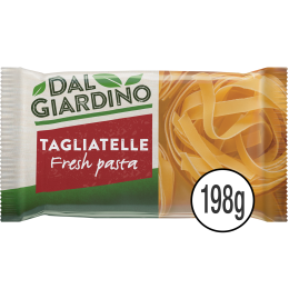
198g
Dal Giardino Fresh Tagliatelle Pasta 198g
★★★★★
£1
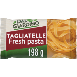
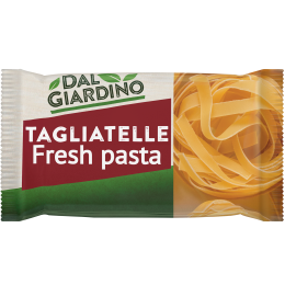
198g
Dal Giardino Fresh Tagliatelle Pasta 198g
★★★★★
£1
700g
Dal Giardino Arrabiata Pasta Sauce 700g
★★★★★
€4.35
723g
Dal Giardino Arrabiata Pasta Sauce 723g
★★★★★
€4.35
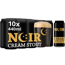
19 washes
Calluna Non-Bio Liquid Laundry Pods 19
★★★★★
£1.95

40 cups
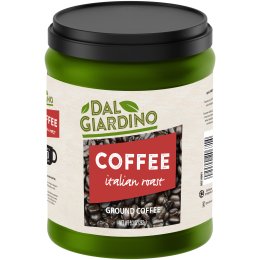
Dal Giardino Italian Roast Ground Coffee 40 cups
★★★★★
$1.95
Calluna Comfort Nappies 86 x size 4
★★★★★
$2.49
Non-conformant
Dal Giardino Italian Roast Coffee 9.3 oz
★★★★★
$2.95
Dal Giardino Arrabiata Pasta Sauce 723g
★★★★★
£1.95
723g
Dal Giardino Arrabiata Pasta Sauce 723g
★★★★★
£1.95
Don’t rely on product titles to convey the 4Ws
Intended outcome
The 4Ws should be perceivable within the MRHI Canvas without reading the full product title which is likely to be shown elsewhere in the Shelf Item.
Explanation
People will naturally focus first on the most colourful aspect of the presentation, the Digital Pack, and may or may not read a full product title before making a replenishment purchase decision. Product titles usually end with the how much of the product but the length of the title varies from one product to another. Therefore reliance on the product title to convey the 4Ws raises two problems:
- it is usually outside the MRHI Canvas and therefore not the initial focus of the consumer’s attention;
- if following normal text flow, the position of the how much information within the product title varies from one Shelf Item to another so that a consumer would need to make more effort to find key information.
Moving the point of fixation [PoF] to glance at the full title should confirm what the consumer has already seen rather than provide new information (see the nail varnish example above).
Florencia Dark Chocolate & Espresso Ice Cream 6 x 5oz multipack
★★★★★
€7.45
Florencia Dark Chocolate & Espresso Ice Cream multipack 6 x 5oz
★★★★★
€7.45
Possible approach to implementation
Note that this individual guideline does not say ‘don’t include a product title’ – they will be present in almost all retailer’s Shelf Items and play an important part in many shopper journeys. Rather, it says don’t rely on product titles to convey the 4Ws.
See the section on remaining challenges for advice on what to do when the chosen visual clarity test and practical reality mean that the 4Ws can realistically only be presented within the product title.
How to test
Check that the 4Ws are present in the MRHI Canvas, irrespective of their presence or absence in the product title.
Provide more specialised information separately
Intended outcome
The MRHI is not cluttered by the addition of information that users are likely to already know or be motivated to look for elsewhere.
Explanation
Many users select products based on personal preference, religion, life choices or medical needs. For example, vegetarian or kosher food, environmentally sourced etc. Including all this information within the MRHI Canvas while maintaining visual clarity is not possible, but neither is it necessary. For replenishment items, the consumer is very likely to already know which products meet their needs.
Possible approach to implementation
Additional information, including detailed product descriptions, can be provided below the MRHI Canvas or on a separate product description page.
How to test
Check that the MRHI Canvas only includes the 4Ws.
Marketing information should not obscure the 4Ws
Intended outcome
The 4Ws are not obscured by marketing information.
Explanation
There is a tension between the uncluttered provision of the 4Ws within the MRHI Canvas and the natural desire to differentiate between similar products from competing brands and between competing retailers selling the same products. The danger is that marketing messages, such as ‘improved formula’ or ‘offer’ will detract from the overall objectives of creating an MRHI. Although they clearly have their place on the Digital Shelf, retailers' promotional overlays and other marketing messages should not impinge on the Digital Pack or off-pack information within the MRHI Canvas.
Specifically, retailers and suppliers are discouraged from obscuring the 4Ws with overlays and marketing information, that is, material that has the intention of persuading a consumer to make a transaction.
In providing this guidance, it is recognised that the boundaries between Which variety, perhaps extended by a Plus One, and a marketing message, is imprecise. For example, a claim such as ‘low salt’ or ‘sugar free’ can be seen as all three.
Possible approach to implementation
The simplest approach to achieving this intended outcome is for the Retailer not to position any overlays on top of the Image Tile. They may, however, be positioned in the surrounding MRHI Canvas taking care not to obscure any other information that might have been placed there.
Florencia Dark Chocolate & Espresso Ice Cream 6 x 5oz multipack
★★★★★
€2.45
Florencia Dark Chocolate & Espresso Ice Cream 6 x 5oz multipack
★★★★★
€2.45
263g
Dal Giardino Italian Roast Ground Coffee 263 g
★★★★★
€4.35


263g
Dal Giardino Italian Roast Ground Coffee 263 g
★★★★★
€4.35

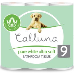
Calluna Pure White Ultra Soft Toilet Tissue x 9
★★★★★
$2.49
Retailers may take a more sophisticated approach if the Image Tile includes embedded Clipping Path information in its metadata, as detailed in the GS1 Image Specifications [GS1Img]. In that case, it is possible to position marketing messages, such as environmental claims, offer flashes, dietary information, award medals etc. over white space in the Image Tile without impinging on the Digital Pack, however this can quickly lead to an inconsistent presentation and is not recommended.
How to test
Check that marketing messages do not obscure any of the 4Ws.
Minimise white space
Intended outcome
The Digital Pack should be as large as possible within the Image Tile.
Explanation
Space is very limited on small screens and, as with any size screen, Shelf Items on a Digital Shelf will be presented in a template designed by the Retailer. Where a Digital Pack is surrounded on all sides by white space, the result will not be additional white space on the screen, rather it simply results in a smaller image.
Possible approach to implementation
If the Image Tile is square, crop the white space as much as possible while showing the product, and centre the image across the shorter dimension. For example, if a product is taller than it is wide, there should be no white space top and bottom and the product should be centred horizontally in the Image Tile.
Some Retailers will prefer to work with rectangular images that crop white space as much as possible in both horizontal and vertical directions. These will be centred by the Retailer in the MRHI Canvas.
By comparison, packshot images for desktop Web sites are generally requested with a 2.5% margin. For a 3000 x 3000 pixels image, that represents 75 pixels.
723g
Dal Giardino Arrabiata Pasta Sauce 723g
★★★★★
£1.95
723g
Dal Giardino Arrabiata Pasta Sauce 723g
★★★★★
£1.95
How to test
Ensure that the image of the product is within a pixel of the edges of the Image Tile in at least one dimension.
Providing the how much (net content, size, quantity, amount)
Intended outcome
The how much, whether expressed as a volume, weight, pack count, number of uses or similar, should be expressed consistently on the Digital Shelf.
Explanation
Unlike a physical shelf, on any given Digital Shelf, all products appear to be of similar size. This exacerbates the problem of providing consumers with clear how much information on small screens. The problem is particularly acute where the same product is available in multiple sizes in identically shaped packaging. It is important therefore to provide the information in a manner that is consistent with consumer’s expectations, which may be guided by applicable regulations and/or cultural norms.
Simple examples:
- the how much of soft drinks is given in fl oz in the USA, ml elsewhere;
- the how much of washing powder is given in no. washes in the EU, oz in the USA, Kg in Australia.
Possible approach to implementation
The same units should be used across the Digital Shelf so that, for example, the how much of one pack of washing powder shouldn’t be given in Kg alongside another given in the number of washes. That said, the units should match consumers’ expectations. So, for example, the unit of measure for breakfast cereals like wholewheat biscuits would be the number of biscuits or, for multipacks of crisps, the number of bags in the multipack. Conversely, a breakfast cereal like cornflakes or a snack like peanuts would be measured by weight, even though they would very likely appear on the same digital shelf with those other products.
There is evidence that simple weights and volumes mean little to consumers who may prefer descriptive sizes such as ‘mini’, ‘regular’ and ‘family pack.’ This guidance does not seek to preclude the use of such terms, however, their use should be applied at the Category level to ensure that consumers can make meaningful comparisons between similar products on the Digital Shelf.
The challenge is greater where there is more than one dimension, for example:
- cat food suitable for new born kittens, available as a multipack of pouches of a given size;
- a multipack of 64 diapers for a child between 8 and 16 Kg.
Typically, packaging for such products is roughly square providing sufficient real estate to show these multiple dimensions within the Digital Pack. How much, when shown off pack, whether it repeats information in the Digital Pack or not, should be provided consistently across the Digital Shelf.
How to test
Check the net content of similar items on the Digital Shelf is shown consistently to allow consumers to make comparisons between products.
Multipacks
Intended outcome
Where the item for sale is a multipack, an individual unit is shown out of the multipack.
Explanation
Multipacks are almost always roughly rectangular and therefore provide plenty of space to show the 4Ws clearly. However, few consumers will be able to visualise what, for example, 8x500ml means. It’s much clearer to show an individual item alongside its multipack, usually to the right. Rather than a relatively complex message like ‘8x500ml’, the image then conveys the much simpler: ‘8 of these.’ The detailed size/weight of each individual item is not always necessary and may be effectively conveyed with simple terms like ‘mini’ or ‘portions.’
Possible approach to implementation
The image should include the multipack and one single item shown outside the pack. The image of the multipack may be decluttered but only to the extent that it doesn’t conflict with the need to maintain product recognition across the physical and digital worlds. As ever, the objective is to convey the 4Ws as clearly as possible.
Consumers will often be able to see that the item for sale is a multipack, and see its contents more easily, if shown from a raised angle, but this must be a decision by the Brand Owner and Retailer. [mutipackExample] shows two different conformant approaches. In both cases, one item from the pack is shown outside it to make it clear what’s in the multipack.
How to test
Ensure that, for multipacks, one individual item is shown outside the pack.
Conformance
With the obvious exception of the guidance on multipacks that only applies in some circumstances, a conformant Mobile Ready Hero Image is one that, when shown in the context of an online retail environment, meets all the individual tests set out in this guideline.
Off-pack text within the image
Throughout the guideline, there are several references to the issue of providing off-pack text within the image, especially the how much. For the sake of clarity:
- an image that includes any off-pack text is not conformant to the GS1 Mobile Ready Hero Images Guideline (for the multiple reasons set out in the guidance on consistency);
- Retailers are strongly encouraged to present the how much information immediately adjacent to the Image Tile, either in the inferior quarter or underneath it as shown in the conformant examples in this guideline;
- as an interim measure, some Retailers may accept the how much in the inferior quarter of the Image Tile but should not be content with this as a long term solution;
- the interim solution is not acceptable to everyone, including at least one major search engine, therefore, where the how much cannot be included in the Digital Pack while maintaining visual clarity, Brand Owners should consider providing Mobile Ready Hero Images with and without off-pack text;
- where the interim measure is used, off-pack text must itself pass the chosen visual clarity test, typically by using a bold, sans-serif font.
Remaining challenges
The presentation of some products, particularly tall thin products such as bottles of soft drinks, raises some issues that are not fully solved by this GS1 guideline. There are some products for which no amount of decluttering and zooming will create enough space to show the 4Ws clearly enough to pass a visual clarity test while retaining product recognisability. The information that this is 250 ml of low sugar sparkling elderflower water made by a brand with a name that's 15 characters long simply will not fit on the bottle. Solving the issue is possible, but only by defining a single approach across brands and retailers that would require a level of prescriptiveness that will be unacceptable to many and conformity that would be hard to realise. Therefore, for now, this document can only offer limited advice.
One possible approach is to present the elements of the product title consistently. A major reason for advising against relying on product titles is that they vary in length and therefore, while the 4Ws are almost always present within the title, their position on the screen jumps around as the consumer navigates the Digital Shelf. Retailers may be able to reduce this inconsistency by chopping up the title and showing the same elements in the same location within each Shelf Item.
723g
Dal Giardino
Arrabiata Pasta Sauce
723g
★★★★★
£1.95
Dal Giardino
Italian Roast Coffee
40 cups
★★★★★
$4.95
[titleChop2] is conformant as the 4Ws are all presented clearly within the MRHI Canvas. The 4Ws are not clear in [titleChop1] (the how much is missing) which makes it non-conformant with the guideline as a whole. However, notice that in both Shelf Items, the Product Title has been split up so that the Who is the brand, What is it and the hoW much all appear on the same separate line, improving consistency across the Digital Shelf.
References
- [CCA]
- Colour Contrast Analyser, developed by JUn of the Web Accessibility Tools Consortium in collaboration with Vision Australia and Steve Faulkner of The Paciello Group (Europe).
- [CSS Pixels]
- A pixel is not a pixel is not a pixel, Peter-Paul Koch (PPK), April 2010. URL: https://www.quirksmode.org/blog/archives/2010/04/a_pixel_is_not.html
- [GB]
- A Gaussian Blur is a widely used effect in graphics software, typically to reduce image noise and reduce detail (from Wikpedia).
- [GDTI]
- Global Document Type Identifier, defined in multiple GS1 Standards including the GS1 General Specifications. URL: https://www.gs1.org/standards/id-keys/gdti.
- [GS1Img]
- GS1 Product Image Specification Standard (PDF) Release 3.1, Ratified November 2017 URL: https://www.gs1.org/sites/default/files/docs/gdsn/Product_Image_Specification.pdf (PDF)
- [MDN]
- MDN Web Docs, CSS Positioning. URL: https://developer.mozilla.org/en-US/docs/Web/CSS/position.
- [MWBP]
- Mobile Web Best Practices 1.0, Basic Guidelines, W3C Recommendation 29 July 2008. Jo Rabin. URL: https://www.w3.org/TR/mobile-bp/.
- [PoF]
- Informally, the point of fixation is the specific place where the eyes are focused. More formally, it is the point in the visual field that is fixated by the two eyes in normal vision and for each eye is the point that directly stimulates the fovea of the retina (from Merriam-Webster).
- [Saccade]
- A saccade (/səˈkɑːd/ sə-KAHD, French for jerk) is a quick, simultaneous movement of both eyes between two or more phases of fixation in the same direction ( from Wikipedia).
- [SCP]
- Separation of content and presentation. Separation of content and presentation (or separation of content and style) is a design principle under which visual and design aspects (presentation and style) are separated from the core material and structure (content) of a document (from Wikipedia).
- [See-It]
- Sight Exclusion Estimator - Interactive Tool. University of Cambridge Engineering Design Centre. See http://seeit.inclusivedesigntoolkit.com/
- [GS1 SmartSearch]
- GS1 SmartSearch, a standard and guideline that helps Retailers to increase sales through more relevant search results and more detailed and accurate product information displayed in search results. URL: https://www.gs1.org/standards/gs1-smartsearch
- [WCAG]
- Web Content Accessibility Guidelines (WCAG) 2.0, W3C Recommendation 11 December 2008. Ben Caldwell, Michael Cooper, Loretta Guarino Reid, Gregg Vanderheiden. URL: https://www.w3.org/TR/WCAG20/
- [XMP]
- Extensible metadata platform (XMP) specification -- Part 1: Data model, serialization and core properties ISO 16684-1:2012 February 2012. URL: https://www.iso.org/standard/57421.html.
Technical annex
The guidance set out in this document are structured to highlight the intended outcomes, not the methods used to achieve them. It is anticipated that experience gained by Brand Owners, Retailers and Solution Providers will inform an update to the GS1 Image specifications [GS1Img] to cover issues such as:
- file naming;
- recommended image size;
- metadata;
provision of which at a high level of prescriptive detail is out of scope for a GS1 guideline. Nevertheless, this annex attempts to offer some guidance.
File naming
The GS1 Image Specifications [GS1Img] provide two methods of naming files: a legacy system with intelligence built into the structure of the name, and a simpler method based on GDTIs. As the previous wording strongly hints, the inclusion of intelligence in the file name is seen as a legacy system, one that is effectively deprecated in favour of using a GDTI. It is noteworthy that some large online platforms and retailers have their own file naming guidelines that, of course, will be of paramount importance to Brand Owners selling via those channels.
Image size
At the time of writing there is a wide disparity in the way products are presented on mobile (this is a key motivation for the development of this document). For example, the size of the image is as little as 90 pixels in some cases while in others, images as large as 600 pixels square are delivered to mobile phones only to be reduced down to a much smaller size within the browser. This kind of implementation is in tension with long-established Mobile Web Best Practice [MWBP] that seeks to find the correct balance between page load time and clarity of the image. The example images in this document are natively 260 pixels square and displayed at 90 pixels [CSS Pixels].
Metadata
The provision of metadata should be easy but in practice often isn't. From the perspective of Mobile Ready Hero Images, it is essential that the 4Ws are explicitly communicated from the Brand Owner to the Retailer. This may be done by embedding the metadata within the image, notably using XMP, but may be achieved by other means as agreed by the parties concerned.
Providing off-pack information consistently
Of the 12 individual guidelines above, one presents a particular technical challenge: the consistent presentation of off-pack information. That individual guideline lists multiple reasons why including off-pack text within the image tile is discouraged. This raises two issues:
- What's the best way to do it?
- If that's too difficult to achieve within a current context, is it permissible to treat the Image Tile and MRHI Canvas as one and the same thing?
The second question can be addressed by stating that the adoption any GS1 standard or guideline is voluntary and trading partners are free to adopt alternatives. If a Retailer prefers off-pack text to be included within the Image Tile, and therefore to treat the Image Tile and MRHI Canvas as one and the same with off-pack text within the image, then so be it.
However, Brand Owners and Retailers are encouraged to go further for the reasons given. The shelf item below is a repeat of a conformant example in the Quick Start Guide. Note: the product title, rating, price information and Add to Basket button are purely to demonstrate how such elements can be included, they are not part of this guideline.
This is an example of one possible approach. It is not intended to be prescriptive, but does show one approach based on established techniques that will be well-known to many front-end developers.
700g
Dal Giardino Bolognase Sauce 700g
★★★★★
£1.95
The HTML and CSS code used to achieve this is shown below.
<div class="mrhiShelfItem">
  <div class="mrhiCanvas">
    <img class="mrhiImageTile" src="DAL_GIARDINO_BOLOGNESE_FLAT_NO_WEIGHT260.png" alt="A 700g jar of Dal Giardino bolognase pasta sauce." />
    <p class="netContent"><span class="size">723</span><span class="units">g</span></p>
  </div>
  <p class="mrhiProductTitle">Dal Giardino Bolognase Pasta Sauce <span>723g</span></p>
  <p class="mrhiRating"><span class="star1">★</span><span class="star2">★</span><span class="star3">★</span><span class="star4">★</span>&;span class="star5">★</span></p>
  <p class="mrhiPrice">£1.95</p>
  <button class="mrhiAddToBasket">Add to basket</button>
</div>
.mrhiShelfItem {
  position:relative;
  border:thin solid black;
  margin:0;
  font-size:0.7em;
  width:310px;
  height: 17em;
}

.mrhiCanvas {
  position:relative;
  width:175px;
  height: 165px;
  background-color:white;
  top:1em;
}

.mrhiImageTile {
  height:90px;
  margin:10px 20px 20px 10px;
}

.mrhiLozenge { /* applied to the netContent. If only on one line, add padding-top:0.4em; height:2.1em */
  width:3.5em;
  height: 2.5em;
  text-align:center;
  background-color:black;
  color: white;
  border-top-left-radius: 0.4em;
  position: absolute;
  left:102px;
  top:90px;
}

.mrhiLozenge .size {  /* makes numeric size bold */
  font-weight:bold;
}

.mrhiLozenge .units { /* units are smaller but also bold */
  font-size:smaller;
  font-weight: bold;
}


.mrhiUnder { /* alternative style for the hoW much */
  position:absolute;
  width:90px;
  margin-left: 10px;
  text-align:center;
  top:90px;
}

/* The following style declarations are out of scope for the guidelines but included for completeness */

.mrhiProductTitle {
  position:absolute;
  left:150px;
  top:0;
}

.mrhiRating {
  position: absolute;
  left:150px;
  top:5em;
  color:gold;
}

.mrhiPrice {
  position: absolute;
  left:150px;
  top:7em;
  font-weight:bold;
  font-size:1.2em;
}

.mrhiAddToBasket {
  position: absolute;
  right:0.2em;
  bottom:0.2em;
  background-color:cyan;
}
The CSS used here is based on absolute positioning. The mrhiShelfItem has a position:relative declaration that allows elements within it to be absolutely positioned relative to the Shelf Item, not the browser window (the mrhiCanvas also has a position:relative declaration to allow off-pack information to be positioned specifically within the canvas). This technique is not as flexible or as easy to work with as CSS Grid, however, browsers that do not support CSS Grid are, regrettably, still in sufficiently widespread use at the time of writing to mean a fall back would probably also have to be provided. IE 11 has limited support for CSS Grid but no previous version of that browser has any. In contrast, positioning was defined in CSS 2.1 and has been effectively supported in all browsers since IE6, FireFox 2 etc. The Mozilla Developer Network offers excellent documentation on the topic if needed [MDN].
Again, for emphasis, this is just one possible implementation. Whether the net content is shown in a lozenge, under the image, or anywhere else in the MRHI canvas is a decision for the Retailer.
Recall that one of the reasons for providing off-pack information as part of the Web page and not the image is to improve search and filtering. It's easy to go further than the basic techniques here and include additional markup that can be used by applications including search engines, using schema.org and the GS1 SmartSearch standard. The example below shows one method of achieving this.
<div class="mrhiShelfItem" itemscope itemtype="http://schema.org/Product">
  <div class="mrhiCanvas">
    <img class="mrhiImageTile" itemprop="http://schema.org/image" src="HERO_DAL_GIARDINO_ARRABIATA_NO_WEIGHT_260.png" alt="A 723g jar of Dal Giardino pasta sauce." />
    <p class="netContent" itemscope itemtype="http://schema.org/QuantitativeValue"><span itemprop="http://schema.org/value">723</span> <span itemprop="http://schema.org/unitCode" content="GRM">g</span></p>
  </div>
  <p class="mrhiProductTitle"><span itemprop="http://schema.org/name" lang="en">Dal Giardino Arrabiata Pasta Sauce <span>723g</span></span></p>
  <p class="mrhiRating"><span class="star1">★</span><span class="star2">★</span><span class="star3">★</span><span class="star4">★</span><span class="star5">★</span></p>
  <p class="mrhiPrice">£2.95</p>
  <button class="mrhiAddToBasket">Add to basket</button>
</div>